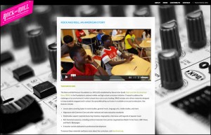
This week we were pleased to launch a sleek, responsive redesign of the Rock And Roll Forever Foundation’s website.
Some key goals for the Foundation were achieved in this quick-turnaround project. First off, it was critical that the new iteration of the small, info-centric site be viewable and navigable on the full spectrum of today’s devices: from desktop PC’s, to tablets, to smartphones – iPhones, Android phones, etc. It was also important that the site’s outdated graphic design be brought more into line with the look-and-feel of the Foundation’s curriculum product, TeachRock.org.
“The Rock And Roll Forever Foundation has such cool, compelling content that this was a really fun redesign to work on,” says Uwe Kristen, one of Boyle Software’s top front-end developers and a responsive design evangelist, “The HTML and CSS are kept as lean as possible and we are happy to report that the site scores 99 out of a possible 100 in Yahoo!’s performance tool. We used Sass and Compass to create modular, reusable CSS. It will be great to bring the lessons learned on this project to an upgrade of TeachRock.org too.”

(Above is how the Foundation’s new homepage appears on desktop Web browsers. At top is how the site looks on an iPhone.)
ABOUT THE ROCK AND ROLL FOREVER FOUNDATION
The Rock and Roll Forever Foundation is a 501(c)(3) created by Steven Van Zandt. Rock and Roll: An American Story is the Foundation’s national middle and high school curriculum initiative. Groundbreaking, geared toward national and state standards, interdisciplinary in scope, featuring legendary performers, the curriculum was made available, in October of 2013, to every interested middle and high school in the USA – at no cost to those schools and districts.